
Amusement Park Branding
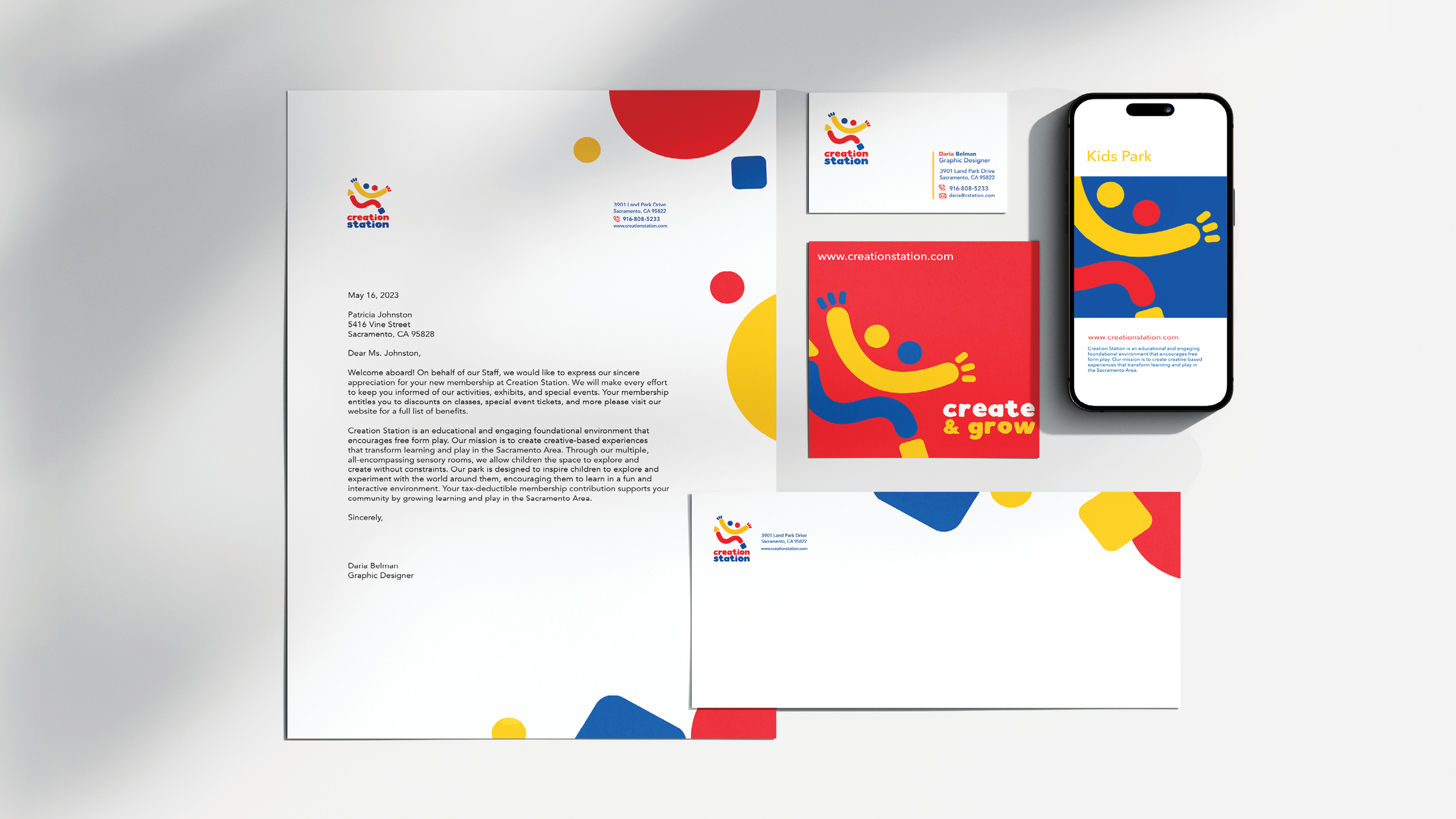
The logo concept for Creation Station, a kids' park, combines various elements to capture the essence of fun and community. It features the letters 'S' and 'C' for the park's initials, along with a smiling face to represent joy and excitement. Two figures running symbolize the sense of community and togetherness found in family and friends. Additionally, the logo incorporates five basic shapes to represent the five senses and the five rooms within the park. The playful typeface adds to the overall sense of childlike wonder and playfulness, reflecting the park's atmosphere and appeal to children. The business system includes a cohesive set of materials such as business cards, welcome letters, envelopes, physical small cards, and digital ads to convey kids' joy and excitement.


